If you have been following me on Instagram you might have seen my social distancing cards. Been doing loads of them to send out to friends and family. While sharing them on facebook I got asked to do a video tutorial on how I color hair. And of course I obliged 🙂
So here is the coloring tutorial and if you are curios on what materials I used for the cards you can see it in the list below. I kept the card pretty simple as I knew I wanted to make many of the cards and I wanted to reduce the time it took to make them.
If you wanna win this card comment on the video before the 25th of April 2020 and I will draw one to win it then.
Supplies:
When possible affiliate links are used, this means that I receive a small commission when products are purchased through the links (at no extra cost to you) I use the money to support my blog and youtube channel. If you like my projects and tutorial please consider supporting me by clicking through these links when you shop. Thanks!
Today it is all about creating a masked blended background with distress inks and oxide inks, using dies and stamps with masking paper to mask out the area. The card is finished off with stamps by My Favorite Things colored in the no-line coloring technique with copic markers.
For the card base I went with a square base measuring 4 1/4″ by 4 1/4″. The first part of the mask was cut with a stitched mod square die out of a 4 1/4 strip of masking paper, so that the mask can cover the card base and a little over to the backside as it will not be folded when I blend.
I also stamped a couple of the clouds and a moon from the Witch Way Is The Candy stamp set onto another piece of masking paper and then cut them out with my scissors. These I placed towards the upper left corner in a little arrangement of three.
I did the blending first with the distress inks in the colors Festive Berries and Wilted Violet, but as I was working on Neenah card stock and I went in with a little to heavy hand I just couldn’t get a good blend, so I finally decided to just take out my oxide inks in the same colors and then just blend on top. The oxide inks are a little bit easier to blend and they are also more opaque so it hid a little bit of the original blending. I finished it off with some water droplets flicked with my fingers and then padded off with a paper towel, to add a little bit of texture.
I then finished off the outside with some fussy cutted images, that I had colored in the no-line coloring technique, fastened with some foam tape. And a stamped sentiment. For the inside I stamped a sentiment, used my left over images and then I added splatters as I accidentally gotten some ink on the inside while blending and though it would hide it a bit.
You can follow a long with both the coloring and the card progress in the videos below. And under that you find links to all the products I used and a list of the copics I used to color the images. Hope you have a great day!
When possible affiliate links are used, this means that I receive a small commission when products are purchased through the links (at no extra cost to you) I use the money to support my blog and youtube channel. If you like my projects and tutorial please consider supporting me by clicking through these links when you shop. Thanks!
Do you want to learn more about blending with markers? Well I’m here to tell you all about it. I also have a video that shows you in more detail different kinds of blending and how blending really works.
I have had this idea in my head for months, I’ve been wanting to break down my knowledge about coloring into smaller easier to digest videos. Videos that is specially about coloring and not card-making. I love my card-making videos but I wished on more than one occasion that I could point you to a video that goes more in-dept on the subject of coloring.
But before we start coloring we need some good paper, as with most coloring mediums papers really makes the difference. For markers you want a dense paper with a slick surface, the ink still needs to be able to go down into the paper, so the tiniest tiniest texture is needed.
I have used Make It Colorful Blending Cardstock for years and I love it, however you can just as well use X-press It Cardstock which is the Copic brand or the paper that many of my fellow US colorists use, Hammermill Color Copy (the one with the frog on). You can use Neenah, but as it is a little less dense than the other papers it can be harder to blend and it can make the colors bleed outside the lines if you have a heavy hand.
Let’s start with the Solid coloring, to get a good blend you need to learn how to get a good solid, well it will make it much easier anyway. The way alcohol based markers work is that they have an alcohol based medium with pigments in. The darker the color the more pigment. This means also the lighter the color the more alcohol, which also means that lighter pens will be juicer and easier to both blend and get a good solid with.
The trick is to go in a medium speed and make sure to overlap the previous line of ink with the new one just a little bit and before the previous line dries. This will help the pigment to even themselves out in the alcohol and will give you less streaks and a more even result. If your first layer looks a little splotchy, just add a second layer before the first has time to completely dry and you will get that even result you are looking for.
For the blending I card I decided to color in the same colors, but add one more pen to the combinations for every step. I usually tell you which markers I use, but as this more how to use the pens and less about that perfect color combinations I have chosen to leave them out.
I use one marker at the top and adding one per step to have 4 markers at the bottom ghost. The way I blend is to overlap the colors slightly, going from dark to light, and what happens is that the extra alcohol medium in the lighter pen will push the darker pigments a little bit further into the paper and make a the overlapping part be lighter than the darkest tone but darker than the lighter. The gradient isn’t perfect but the more pens you add the easier it is to get that smoother blend. Also the more contrast between the darkest and the lightest the more 3D like dimension you will get.
The last ghost card is all about cross blends, using a color from a completely different color family to add that little extra. The first column I used a marker that had the same value as the grey but a completely different color. Purple, blue, green and orange, in that order and then I did a grey blend with three markers on top. The most important tip with this kind of coloring is NOT to choose a color that is much darker, than the lightest grey. That will cause the alcohol medium in the lightest grey to push the pigment in the colored pencil, unevenly into the paper and that causes a very unpredictable splotchiness.
For the second column I used a marker from another color family as the shadow, always choosing a color that goes towards the cooler spectrum. From the top to the bottom, a Blue shadow with a green blend, a red shadow with a orange blend, a purple shadow with a pink blend (should have chosen a lighter purple though) and lastly a purple shadow with a blue blend. This causes a deeper more natural shadow however they can be a little bit harder to blend if you stray to far away from the base color.
The third column has two colored gradients just because it was fun. It is easier to work with lighter colors and I would recommend using grey to shadow with if you want to have some dimension to them. However I choose to just make the gradients. From the top Mint and Blue, Blue and Purple, Purple and Pink and the last one pink and green. Doesn’t the last one look like a watermelon? All it needs is som black/grey dots in the pink part.
Well if you have read this far, thank you so much for taking the time. I would really appreciate of you left me a comment telling me how you like the content and if there is something else you want to see either here or on my channel or on both.
Supplies:
When possible affiliate links are used, this means that I receive a small commission when products are purchased through the links (at no extra cost to you) I use the money to support my blog and youtube channel. If you like my projects and tutorial please consider supporting me by clicking through these links when you shop. Thanks!
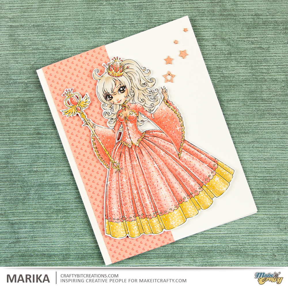
Hi Everyone! Have you heard yet that the coloring challenges are ending? Well there is one last left, and it’s as easy as can be as it is Anything Goes! With the challenges ending I knew I wanted to “go out with a bang” (don’t worry, I’m not going any where). But I wanted to create something spectacular, but at the same time very much me, clean and simple with a twist.
So todays twist is coloring glitter effects! Zoe introduced me to this technique and I want to add it to everything, but I’m trying to keep myself a little bit contained tho. But with this being the last I’m adding to my whole character. I’ve choosen to go with Alwina the Good Witch and with her spire and crown I felt she looked like a queen so that is what I went with.
I choosed to go with reds and yellow as they are royal colours, but I wanted it to be towards the softer spectrum, so she is more coral than red and then I went with my favourite yellows for the golden tone. With the colors being very soft and I didn’t want her hair to be the focal part, I choose to go with a ash blond color. Then I went to town on adding all the sparkles, there is two videos for that, you can either look at the card making video and get the sped up version or you can go for the real time and see every little dot as I made them. I had printed Alwina out rather on the bigger side (well big for me, she still fits on an A2 card size, 4 1/4″ x 5 1/2″) so there was not much room for anything else, and also I really wanted her to be the crown of the card. So I finished it up with a little strip of pattern paper that both matches the dress but also simplifies the silhouette, and some chipboard pieces to make the card a little more even.
When possible affiliate links are used, this means that I receive a small commission when products are purchased through the links (at no extra cost to you) I use the money to support my blog and youtube channel. If you like my projects and tutorial please consider supporting me by clicking through these links when you shop. Thanks!
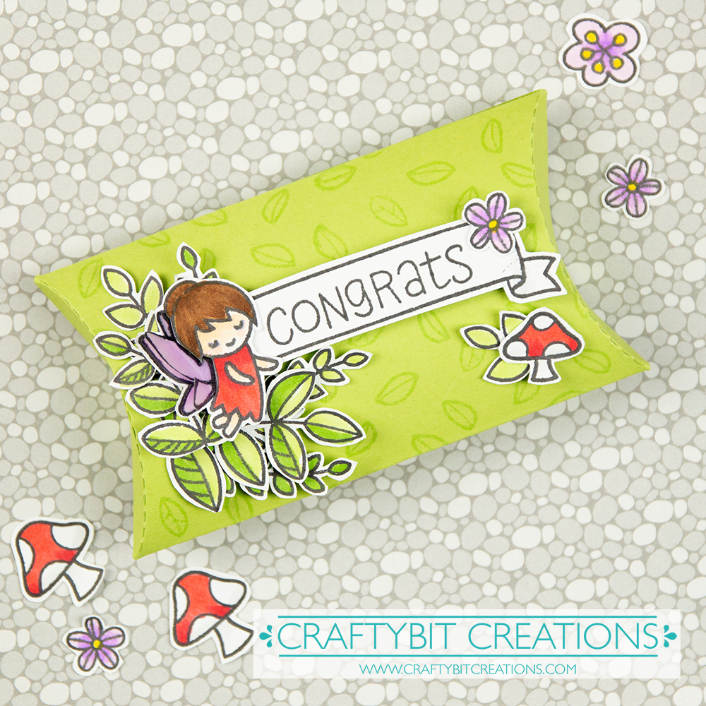
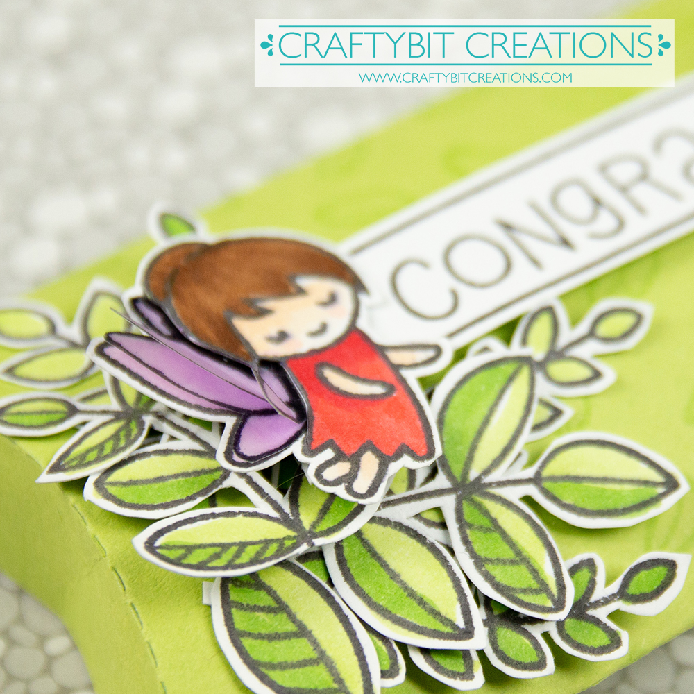
Hi Everyone! Do I have something fun for you today! I love challenges, and I’m trying to get back to entering some, as it was a long time since. It was also way to long since I was using my Lawn Fawn stamps so decided to join the Lawn Fawnatics Challenge this week which is Flowers, Floral & Foliage.
As usually when starting out for any challenge I collect all my stamps set and dies that could suit the challenge, and doing that I saw my pillow box die and a plan started growing. Something I love doing is creating groupings of foliage in a corner and add flowers and other details to that group. So that is what I decided I wanted to do.
I started with some tone on tone stamping on the pillow box, this will make the background not so plain, but at the same time be so soft that it won’t compete with our details. I then stamped up loads and loads of foliage and detail stamps from multiple stamps sets, colored them all in with copic markers and cut them all out. When doing this kind of creations is when I miss not having the coordinating dies.
Then I layered all the different images and glued them down, and the box was finished. If you want to see in more details every set, watch the video below. Where you also find the real time coloring video where I go through the coloring. Also for all the pens and materials used, you find that detail underneath the videos as always. Happy Crafting!
When possible affiliate links are used, this means that I receive a small commission when products are purchased through the links (at no extra cost to you) I use the money to support my blog and youtube channel. If you like my projects and tutorial please consider supporting me by clicking through these links when you shop. Thanks!
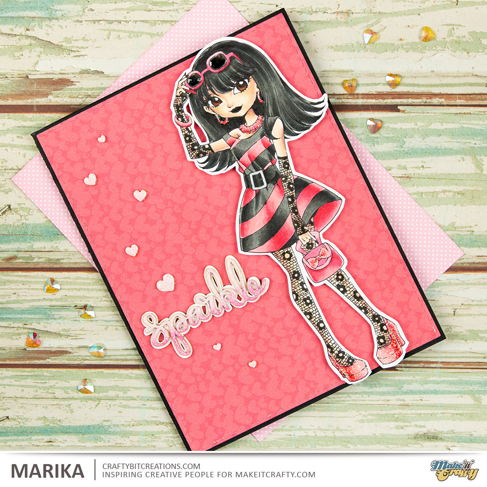
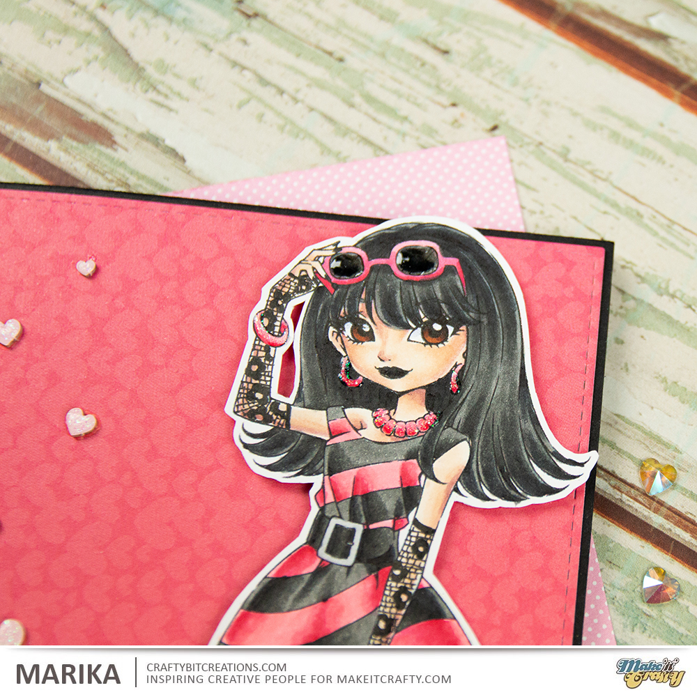
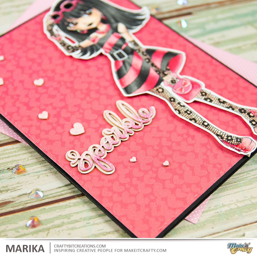
Hi Everyone! Marika here with another card and video tutorial. You might have seen this card before as it was featured on the Make It Crafty challenge a couple of months ago, (just looked it up, it was in february!!!). I finally gotten to edit the video and I really wanted to share it with you.
So the challenge (in february?!) was to add details with a multiliner, it could really be anything, adding another pattern on a dress, really anything. Just before creating this card, Nicoletta shared her card in our design team group, and I just piggybacked on it. She added net tights on her character and just had to add some on mine, but with a twist.
When I was young I had a pair of lacy fingerless gloves, they where red and one of my priced possessions. Funny thing is that I loved them just as much when I was a toddler as I loved them when I was a mid teen, and I did use them. And that together with Nicolettas card made me create this one.
I really love taking Classy Olivia, which is a very posh girl, and just by adding those details, the lacy tights and and the lacy fingerless gloves, and also adding another color scheme, she is transformed to someone that is a little more like me, well the 16 year old me anyway.
With all the details in the card I felt I wanted to make the card clean and simple, I love clean and simple cards, but clean and simple doesn’t need to be colorless. So I choose a very punchy paper, that had a very light pattern, put that on a black cardbase, I even decorated the inside so that you can write on it without a white gel pen. I then added a sentiment from cardboard pieces, and the last details was a couple of hearts. As usual if you want to see the process you can watch the videos below.
When possible affiliate links are used, this means that I receive a small commission when products are purchased through the links (at no extra cost to you) I use the money to support my blog and youtube channel. If you like my projects and tutorial please consider supporting me by clicking through these links when you shop. Thanks!
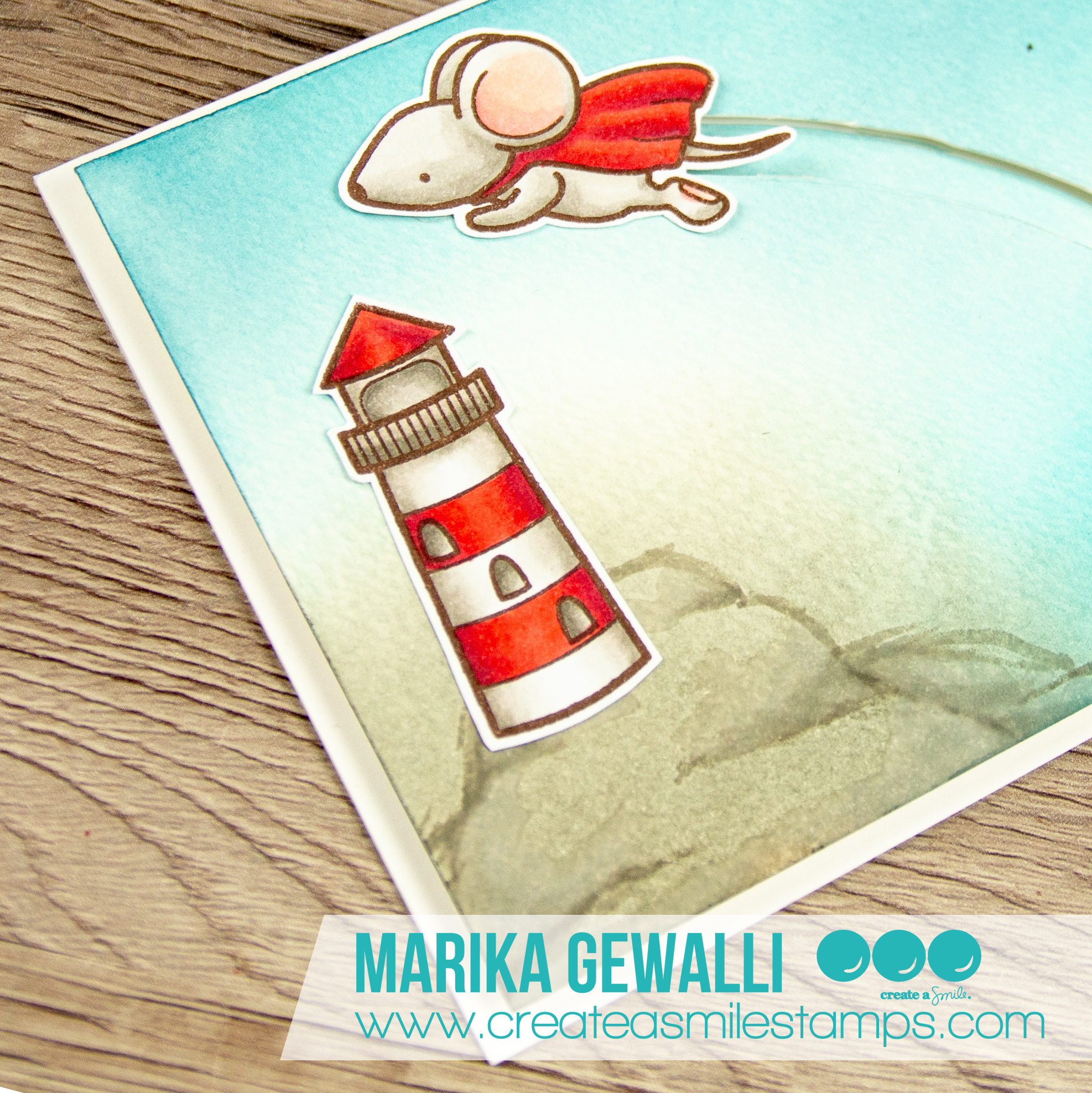
Hi Everyone! Got a new interactive slider card for you today. I love making interactive cards, some more fiddly than others but this one is very simple and very quick to make.
There are so many tools out there today that you can use to make your interactive card, but today I’m just using a craft knife and a pencil, making a very simple track but which fit perfectly for the card I’m making. I’ve made a video below to show you every step to make the card, and I’ll give you a couple of tips along the way.
Sometimes you get an idea to a card the first time you see the stamp set, and I knew that I just needed to make a slider card together with the super mouse from the Superpowers stamp set by Create A Smile Stamps. I wanted to make him fly over something so I dug through the other stamps I had by Create A Smile and I found the Glowing Seaside stamp set with the awesome lighthouse. That coupled with me being on vacation to the west coast of Sweden, which have loads of lighthouses really set the mood to the card and it all came together.
I decided to make a very soft background, just blending on a couple of colors of distress inks, I decided to use Mermaid Lagoon, Pumice Stone, Stormy Skies and Hickory Smoke, but after doing the blending I felt that the hill that I wanted to set the lighthouse on needed a little bit more definition. So I grabbed my trusty Copic Markers and loosely sketched it out, with just a tiny tiny blending. If you choose to do that to, remember that Copic don’t recommend you using the markers over any medias, and that drawing on top of other pigments can ruin your nibs, so it’s on your own risk you do this. Also watercolor cardstock is very porous and will use loads of your ink from your pens, but I felt safe as I used it so little.
When possible affiliate links are used, this means that I receive a small commission when products are purchased through the links (at no extra cost to you) I use the money to support my blog and youtube channel. If you like my projects and tutorial please consider supporting me by clicking through these links when you shop. Thanks!
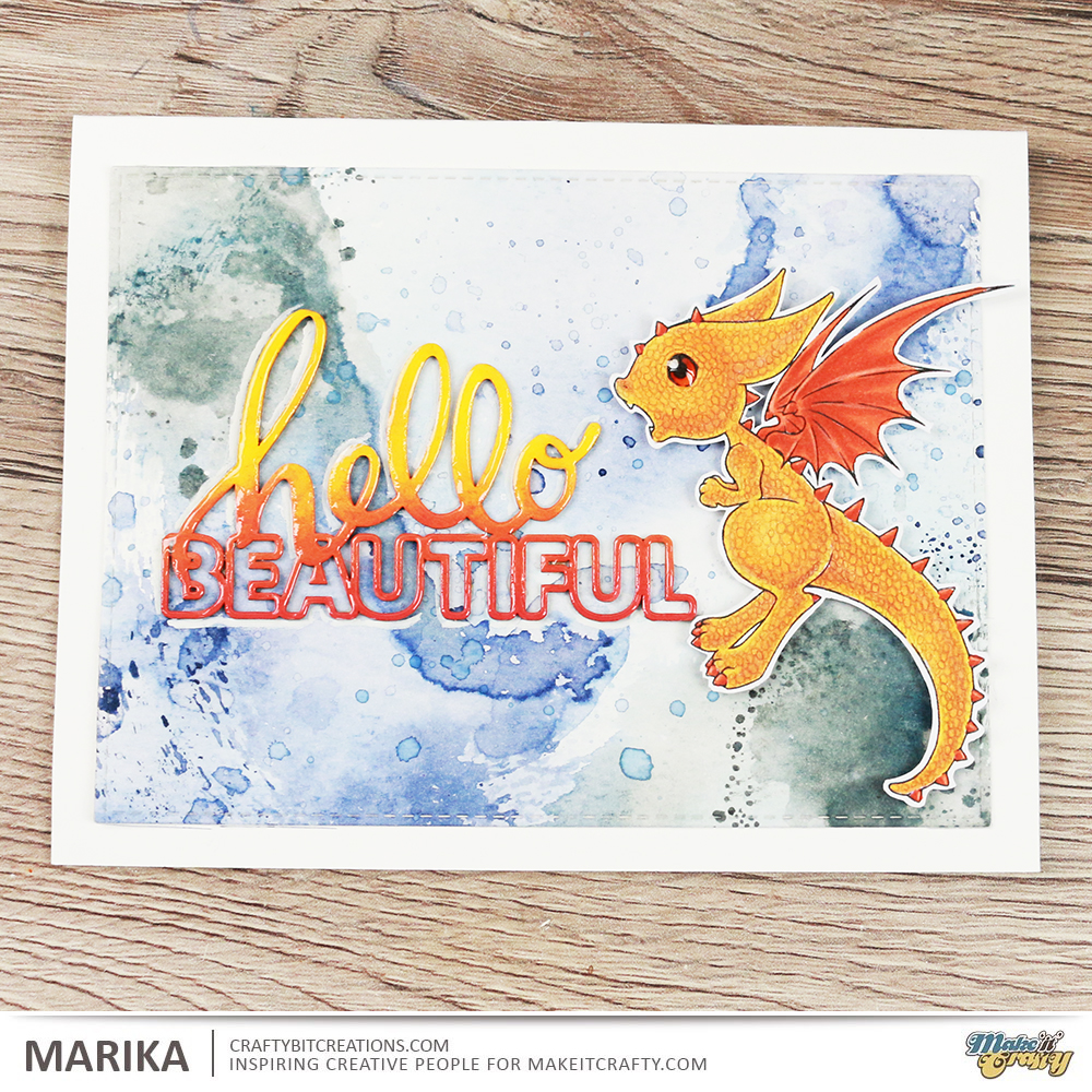
Hi Everyone, did you like my dragon last week? I had so much fun creating it, and while looking for a image to use for that card I came across the image I’m using in todays card.
The stamp I’m using is called Sam’s Lizard and is by Make It Crafty, I used the same technique for the scales on the lizard as for the the dragon on last weeks card. I fell in love with the adorable face of Sam and I do not color enough guys or make enough guy cards.
The whole card is in neutral tones, which both works great for male cards but also lends it self for more storybookesk cards. I colored Sam and his Lizard with Copic Markers and added details with a couple of pencils. You really don’t need a full set of pencils, you can come very far with just 12 pen set if you are just using it for details like these, but if you are like me you might want them all.
I knew I wanted to have a very soft background, I was thinking sitting on a wooden dock by the water, but couldn’t find a good digi for it, and then I dawned on me that I wanted the stone wall. So I googled stonewalls to find different sorts, decided on what kind I wanted and sketched one up on my watercolor cardstock. Using watercolors for soft backgrounds are great, they give those soft and watery colors. I have a small 12 pan Winsor & Newton Cotman set, you really don’t need more and it’s a great way to get into watercolors as they are the “student” set and are actually quite affordable.
To get a cohesive look I started off by mixing a grey tone, this set doesn’t have a black, but it’s quite easy to blend together a greyish tone, I used a cold blue and a orangey red to get a purply grey. Then for every color I then add a little of that color and it ended up being really cohesive. I even colored the chipboard sentiment with the same colors to make it tie in.
And you really don’t need any fancy things either to watercolor, the smaller brush I’m using is a Cotman brush and really affordable and then I’m using a IKEA 365+ plate to mix on, have found that I really enjoy mixing on porcelain as the colors have a tendency to bead on plastic but they flow on porcelain.
If you want to see how I created the whole card I have both the card video and the real-time coloring video, you can choose which ever you like the best, or watch both if you want.
When possible affiliate links are used, this means that I receive a small commission when products are purchased through the links (at no extra cost to you) I use the money to support my blog and youtube channel. If you like my projects and tutorial please consider supporting me by clicking through these links when you shop. Thanks!
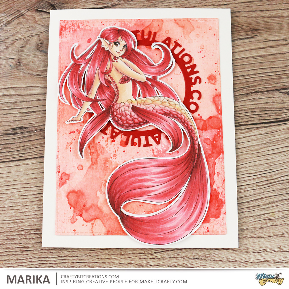
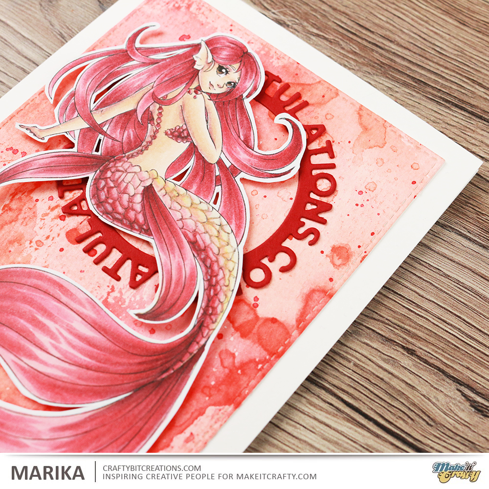
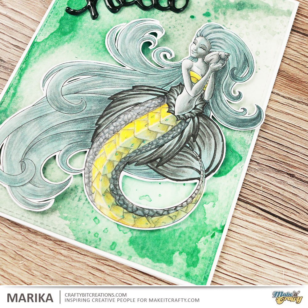
Hi Everyone! I’m here with another card and another tutorial. Today I’m following this months coloring challenge from Make It Crafty, color ANIMALS, with an emphasis on animal textures, feather, fur and scales. Zoe likes to challenge us DT girls a little extra, and this time around she gave us the specific texture to work with. I got scales, and actually did a bunch until I settled on the one I made for this post, You’ll find them at the end of the post.
But first to today card and videos. I ended up choosing the Fiery Dragon, I colored him up before, I even have the honor to have my coloring being on the front of the package for the dragon! Btw I’ve used the digital stamp but you can also get him as a rubber stamp, and right now there is a great sale on rubber stamps!
I have colored Fiery in some gorgeous yellows and oranges with my copic markers and then added the scales with some colored pencils. I then made a smootching background in some blue and greys, I choose blue as it is the complimentary color to orange. I also used Hello Beautiful Chipboard Word and colored it with ditress paints in the same color scheme as the dragon.
As I said I did a couple of test, playing with scales, I do really love them but they are very time consuming so decided not to reproduce them for video and go for the dragon instead. But I thought I share them here too to give you some more examples to what you can do for the challenge.
Supplies:
When possible affiliate links are used, this means that I receive a small commission when products are purchased through the links (at no extra cost to you) I use the money to support my blog and youtube channel. If you like my projects and tutorial please consider supporting me by clicking through these links when you shop. Thanks!
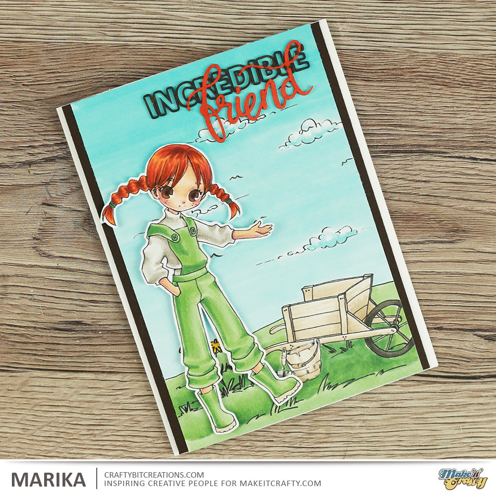
Gosh it’s been a month! My new job is keeping me busy and I have a few more things that is keeping me occupied, more of that another time. I finally got a couple of videos edited so today you get my Spring Skies duo. If you haven’t joined in with the spring skies coloring challenge over at Make It Crafty I really recommend you do! It’s loads of fun!
If you are unsure what to do you will find all the details over at the challenge page and there you also find a real awesome discount offer on the Coloring Skies E-book which was a steal even before the discount. So come and join us!
For some more inspiration and a tutorial you can see the videos below of how I made the Incredible Friend card, loads of great tips and tricks on how to color a sky.
When possible affiliate links are used, this means that I receive a small commission when products are purchased through the links (at no extra cost to you) I use the money to support my blog and youtube channel. If you like my projects and tutorial please consider supporting me by clicking through these links when you shop. Thanks!


 https://linkdeli.com/widget.js?id=36e575d4b4503edd8f9a