
Hi! Sometimes you make a card and the finished product isn’t the way you imagined. You feel it’s lacking something. That was what happened to me for this card. I re-made the card and really liked my second card so I thought why not turn this into a learning experience.
Todays video is showing you how I made the first card and then also how I made the second, letting you know the changes and why I made them. It’s a little bit longer but I hope you still like it!
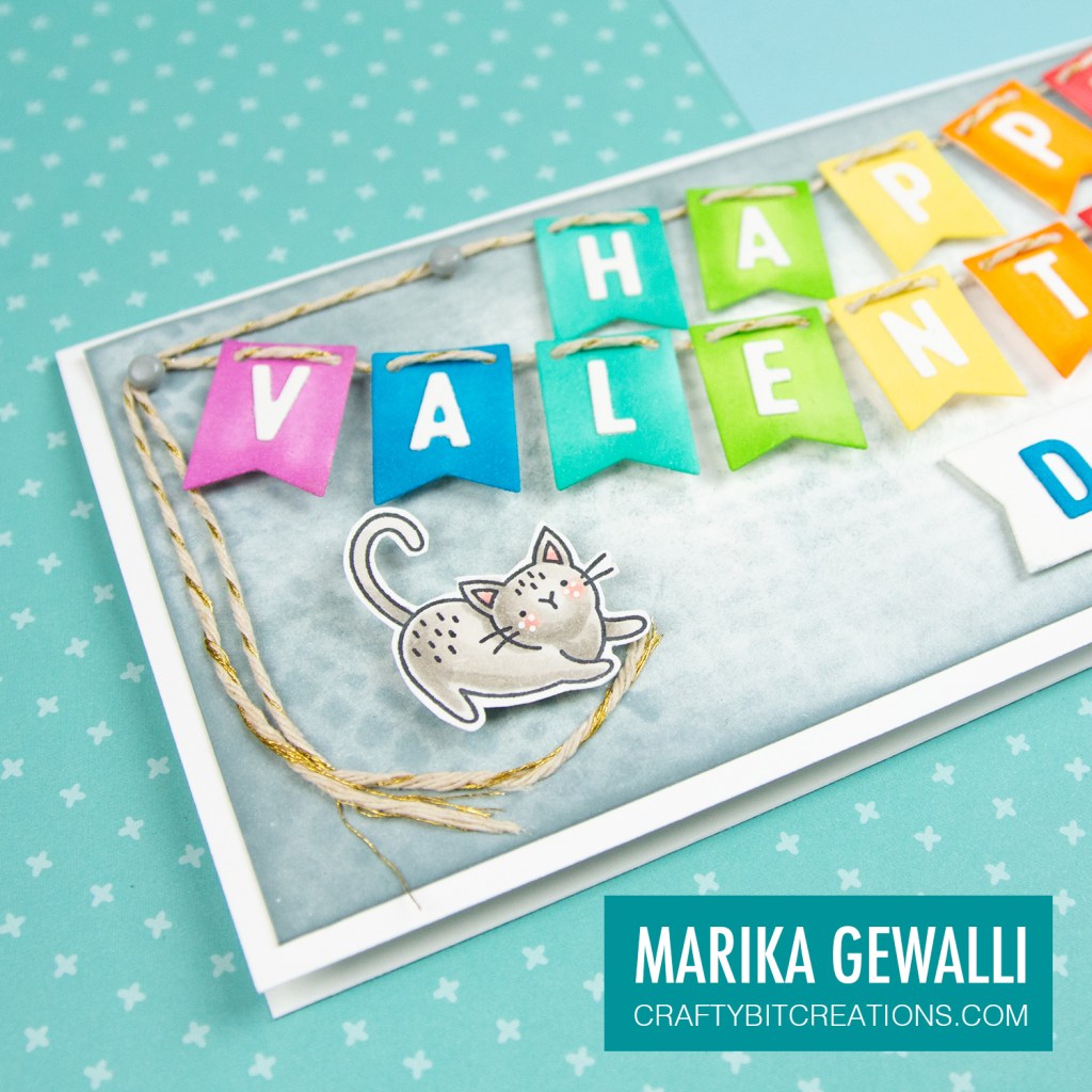
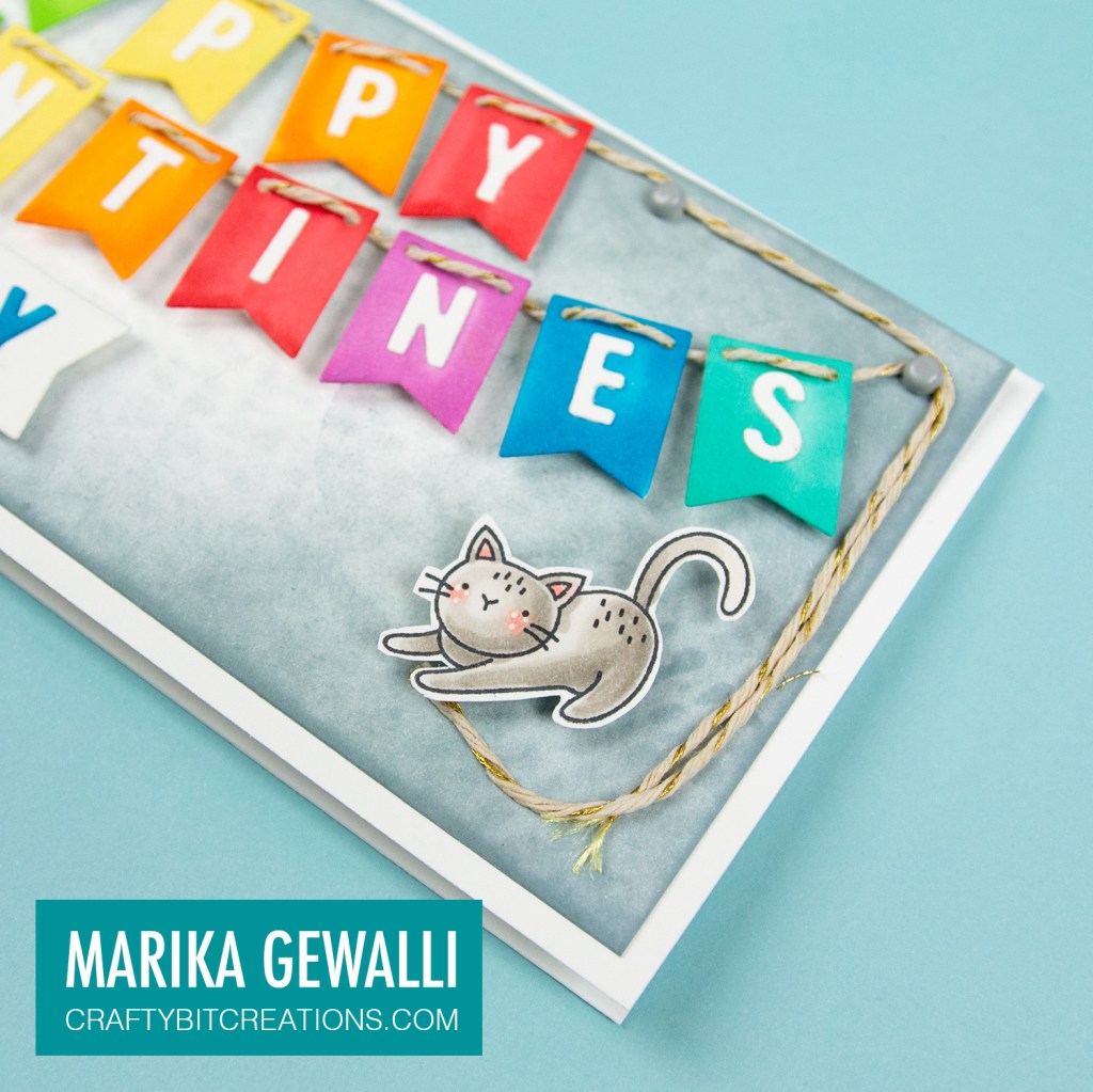
The idea behind this card is simple. I wanted to use the Bitty Banners and Alphabet Die-namics for my sentiment, I felt it would be fun to let the kitties from the Mini Meows stamp set play with the strings from the banners and I choose to do this on a slimline card base because I needed the width of the card.
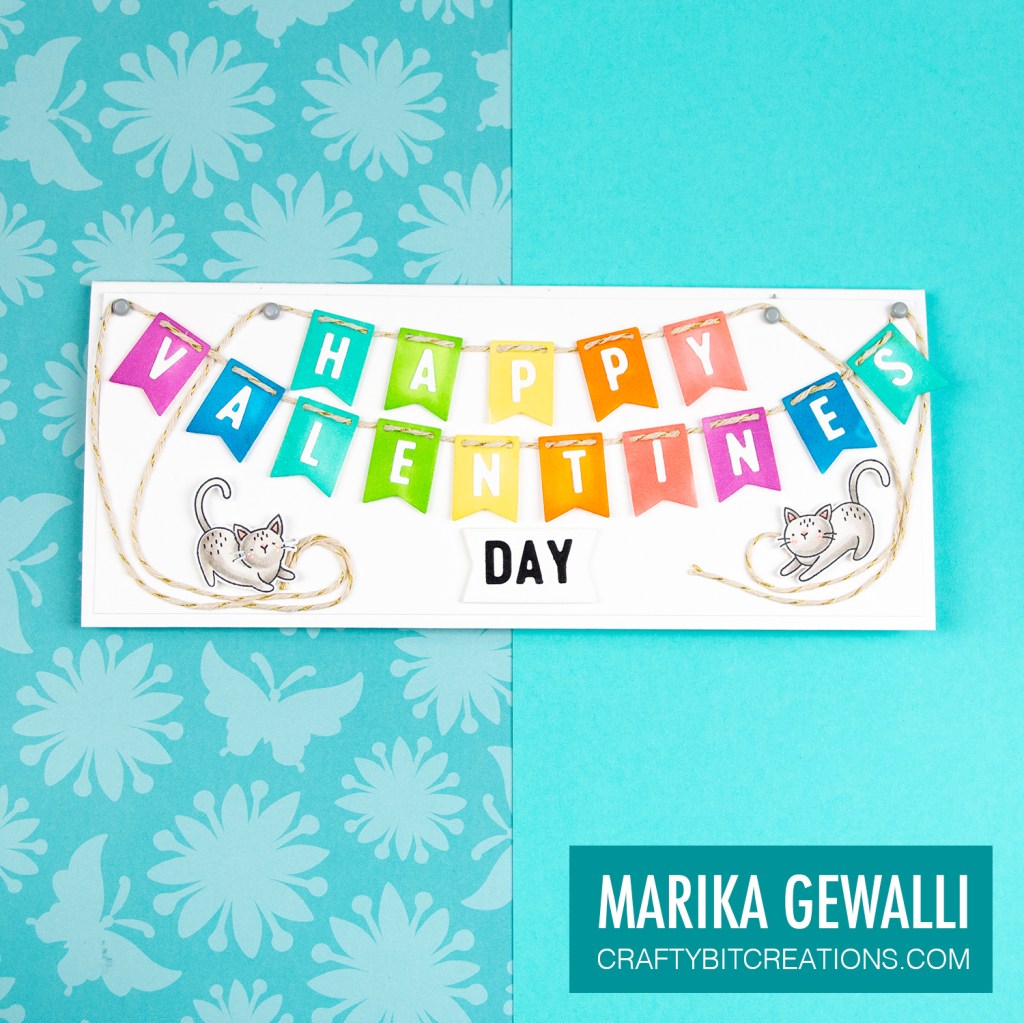
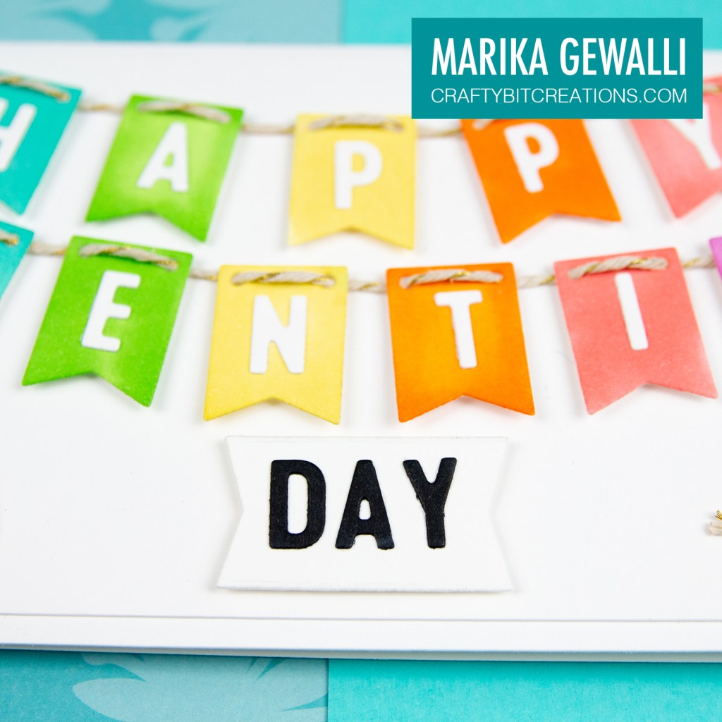
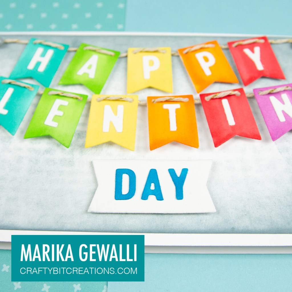
I really wanted to have a simple textured pattern paper as the main panel, however most of my pattern papers are 6×6 and isn’t wide enough, so I settled with the white background. For the banners I went with a rainbow color scheme, I went with a mid tone so the white letters would show up against the flags. I did do a white banner for the word day and those letters I colored black.
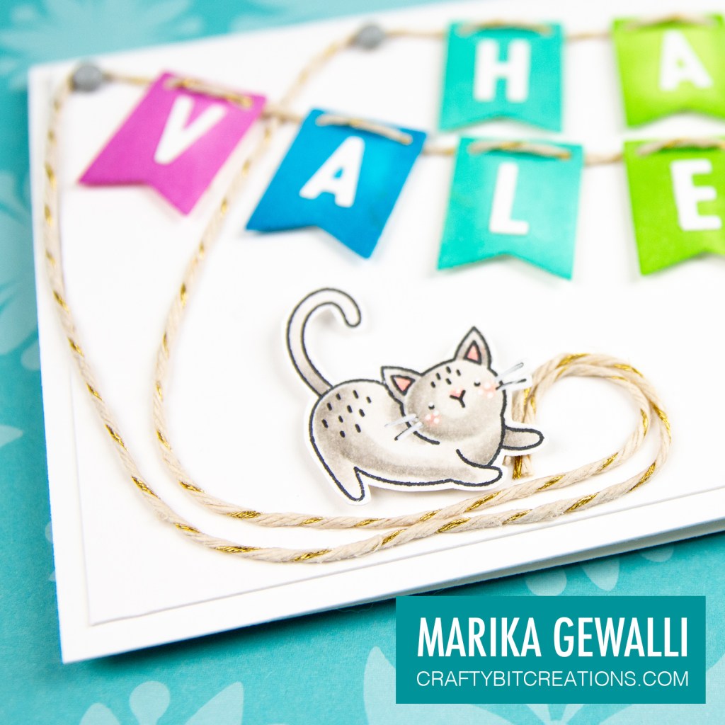
When attaching the flags that I added to two strings, the world VALENTINE was a little to spread out and there for to get the string ends from the HAPPY down to the lower part of the card (so the cats could play with them), I let them go between the letters in VALENTINE. I added glue to the strings and placed them on the card in two curls, and the placed the cats so it looked like they where playing with the strings and that finished the card.
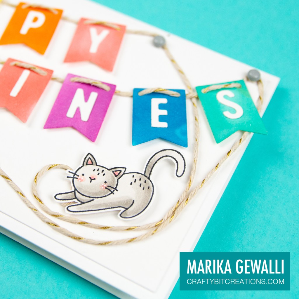
When looking at the card I felt it looked a little bit flat with the white background but at the same time a little too busy with the strings crossing each other. Also I didn’t like the black letters on the word DAY as it stood out to much.
So I made card number two. I started by giving the panel some color and texture by blending Weathered Wood and Iced Spruce first just on the panel and then over the Burlap stencil. Then I made the banners, by accident I picked up a darker red than before but I really like it! For the day word I used the blue marker that I used in the banner to make it more cohesive. I placed the flags closer to each other so that I could run the strings on the outside of the VALENTINE banner, making them frame the whole card.
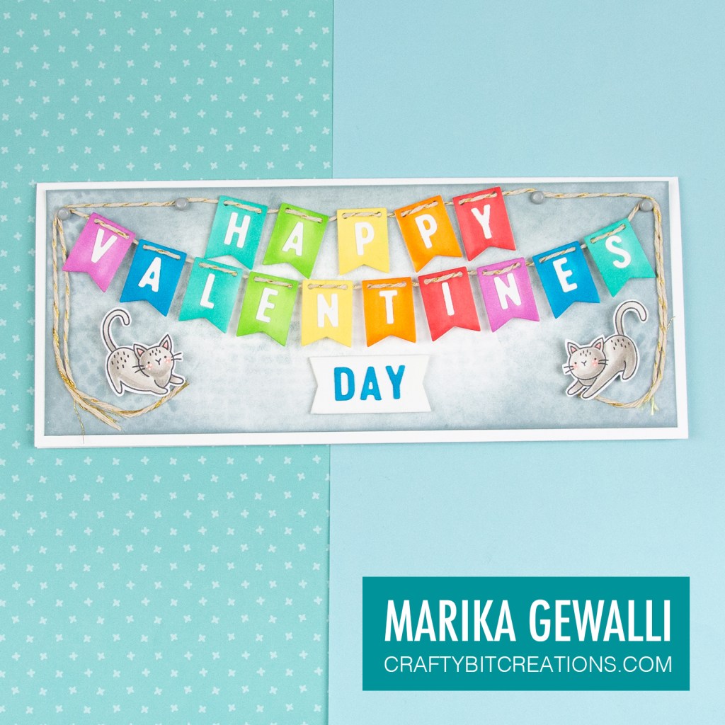
With those small changes we got a whole new card. I feel the card is more balanced now. What do you think?
Copic:
Banner: BG13, YG05, Y13, YR04, R32/R35, V05, B05
Cats: W0, W2, W4, R30, R32
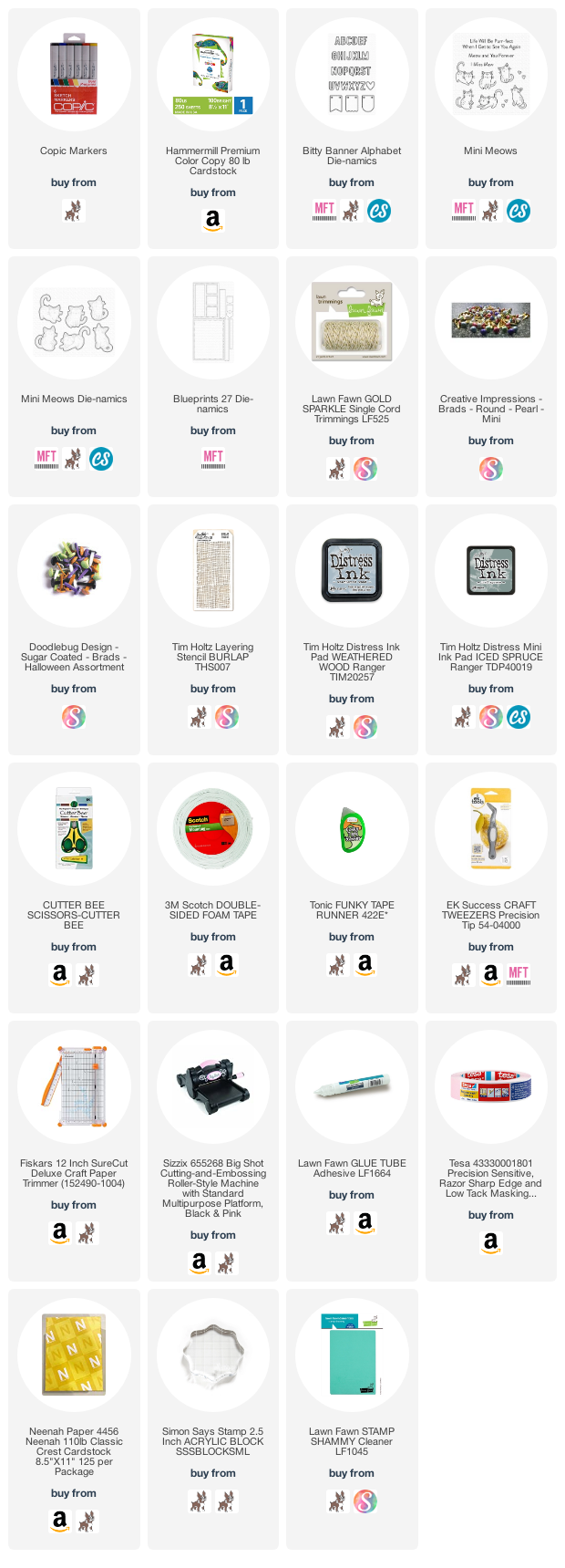
Supplies:
When possible affiliate links are used, this means that I receive a small commission when products are purchased through the links (at no extra cost to you) I use the money to support my blog and youtube channel. If you like my projects and tutorial please consider supporting me by clicking through these links when you shop. Thanks!
 https://linkdeli.com/widget.js?id=f5e8378456858c916708
